
What is a Multi-Type Assessment? #
A Multi-Type Assessment rates a respondent in each of several categories.
- That’s like a report card that gives you grades or scores in several subjects.
- For example, an assessment can ask, “What would you most like to study in college: arts, sciences, or business?” You can give the respondent a score for every type, along with custom feedback:
- “You scored High on interest in sciences. That means you will likely be very motivated if you major in science. Here are some resources to guide you….”
- “You scored Medium on interest in the area of business. That means this may not be the best choice for your major. Here are some resources to help you learn more….”
- “And you scored Low in arts. That means this would not be a good choice for your major.”
Navigate to the Types Tab #
To set up types for your Type assessment, start by entering the Agolix editor.
First, select the “Edit” link in the menu underneath your Type assessment.
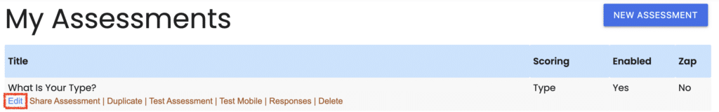
Then click on the “Types” tab at the top of the page.
The “Types” page is where you’ll set up the different types (or categories) used to score the questions in your assessment.
It’s also where you provide score interpretations for each of your types.
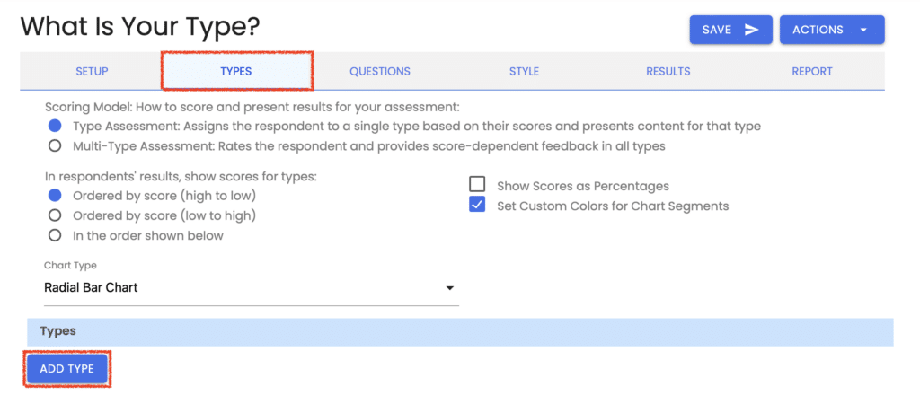
Choose Your Scoring Model #
You can set up your assessment scoring in one of two ways:
- Type Assessment: Assigns the respondent to a single type based on their scores and presents content for that type.
- Multi-Type Assessment: Rates the respondent and provides score-dependent feedback in all types.

NOTE: If you’ve chosen the first option, please go to the Creating Types For Your Type Assessment.
Manual and Automatic Scoring #
With a Multi-type assessment, you’ll also see an option to select whether to use “Manual” or “Automatic” scoring.

Automatic Scoring #
With “Automatic” scoring, Assessment Generator assigns how many points go in each “Score Band.”
The total possible points are divided by the number of Score Bands; so if your assessment has 100 points and 4 Score Bands, each band covers 25 points.
Manual Scoring #
With “Manual” scoring, you set the values for your “Score Ranges“ however you like.
For example, you can have High, Medium, and Low Score Bands and set the Score Range for each Score Band.
We’ll cover creating score bands for your types in more detail below.
Set Type Presentation Order #
The following section is where you decide the order in which the types are shown to the respondent after they complete your assessment.

With the first option, the types are shown from the highest scoring to the lowest for each respondent.
The second option allows you to set the order from lowest scoring to highest scoring.
The third option allows you to set the exact ordering for each respondent regardless of how they score in each type.
Select the Chart Type #
Next, select which chart type you would prefer for your respondents’ results:
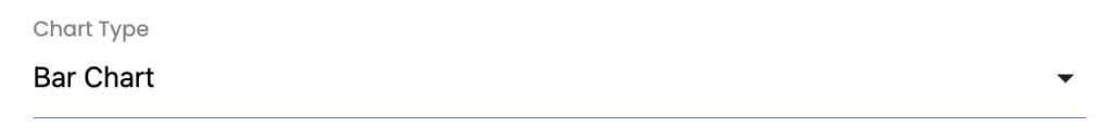
There are 4 chart styles from which to choose:
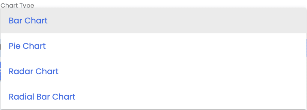
NOTE: When you set up your results in the “Results” tab, you’ll also want to select where your chart appears. You can include respondents’ results on their browser screen, the results email, and the PDF report. You can also opt to turn the chart off completely. See Setting Up How Respondents Receive Their Results for more details.
Show Scores as Percentages #
If you want to show assessment scores as percentages of the total score, check the box for “Show Scores as Percentages.”

When this boxed is unchecked, the scores are based on the raw point values that you assign to your questions.
Set Custom Colors for Chart Segments #
You can next choose whether to set custom colors for each chart segment.

When you check this box, you’ll be given the option to assign a chart color for each type you create. These colors will be displayed when you choose a bar chart, pie chart, or radial bar chart.
If this box is unchecked, the system default colors will be used for your results chart.
Create Your Types #
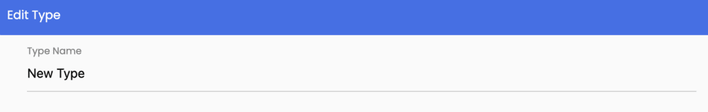
Next is the area where you enter your types. Add as many or as few types for your assessment as you’d like.
Click on the “Add Type” button.

Then enter a name for this type.
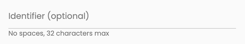
Enter a Type Identifier #
Enter an identifier to reference your type score in your results as a “Merge Code.”
The identifier should be a name to help you refer to your type. Your respondents will not see it.
When you use an identifier as a merge code in your results, it will have ### before and after, but don’t include them here.
For example, let’s say you use “type_1” as your type identifier. When you want to reference the score for this type in your results, you’ll enter it there as ###type_1###.
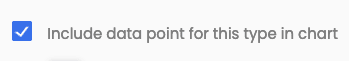
Include Data Point for this Type in Chart #
If you wish to exclude this type from the chart and the numeric scores shown in the results, de-select this checkbox. In that case, if your assessment is configured to calculate an overall total score across all types, the score for this type will not be included in the overall total.
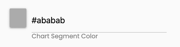
Assign a Color to Your Type #
If you selected the option (above) to set custom colors for your types, you would see a place to choose your bar, pie, or radial bar chart color for this type.
There are multiple ways you can change the color assignments in these fields.
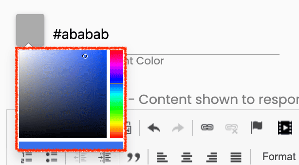
Select Color Box #
You can click on the color box and select a color from the spectrum.
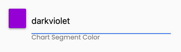
Enter a Color Name #
You can type in the name of a standard color.
Check out this list of color names that are supported by all browsers.
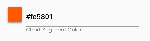
Enter a Hex Code #
If you know the hex code for the color you want, you can enter it on the line.
Enter Your Type Description #
Next, add your description for this type.
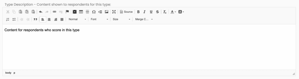
Note: The “Type Description” will show for every type, regardless of the score. Enter the content you’d like to show regardless of how the respondent scores. If you only want the score interpretation to be shown, leave the Type Description blank.
Then click the “Save” button to return to the “Types” page.
Repeat this process until you’ve added all of your Types.
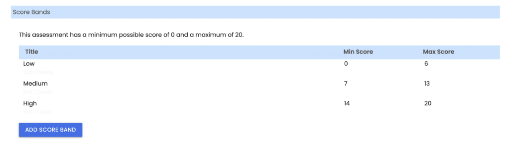
Create Your Score Bands #
The next part of the page Is where you create your Score Bands.
Based on the point assignments you’ve made when you set up your assessment questions, the message here will show you the minimum and maximum possible scores for your assessment.

Add Score Band #
Click the “Add Score Band” button to create a score band.

Title Your Score Band #
Add a title for this Score Band. Your respondents will not see this title, so you can name it something that makes sense to you.
Common names for score interpretations are “High,” “Medium,” and “Low.”

Set The Score Range (for Manual Scoring only) #
Set the minimum to maximum score range limits for this Score Band.
This area will be greyed out if you have “Automatic” scoring turned on.

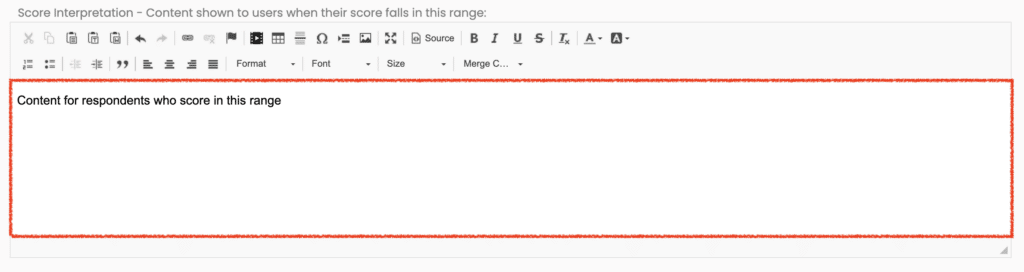
Enter Score Interpretation #
Next, add the feedback for respondents to receive when they score in this range.
Save and Repeat #
Then click the “Save” button to return to the “Scoring” tab.
Repeat until you have added all of your Score Bands.
Please review the rest of the User Guide to learn more about our software.
Thank you for choosing Agolix by Assessment Generator!


